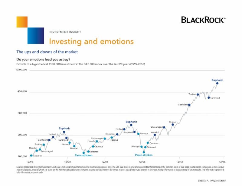

Do you know how the market has behaved over the last 20 years? How have you managed your investments over that time? Do you see any kind of pattern? Does this chart from BlackRock mean anything to you? Bear in mind, it stops at the end of 2016 and the S&P has increased nearly another 20% since then, so it’s even higher than the chart shows!